 Loading... Please wait...
Currency Displayed in
- Home
- Travel Maps
- Austria and Salzberg itmb Travel Map
Categories
Austria and Salzberg itmb Travel Map
Product Description
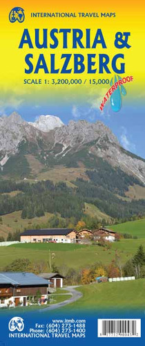
Austria is one of my favourite countries in Europe. It captures the best of both Germany and Switzerland without the same brashness or expense. This is our second version of the country, which is brand new artwork for us. We have tried to capture the mountainous nature of Austria through hill shading as well as hypsometry and I have mixed views as to whether or not road and visitor information shows as well as it should. Austria is a long, thin country, and to fit it on to a standard-sized sheet at this scale, we have been forced to show the westernmost portion, and the enclave of Liechtenstein as a large inset. The other side of the sheet is also a new step for us. We acquired a data base for Salzburg while in Europe in the spring. It nicely fills the sheet and, unusually, includes nearly all the urban area. We also decided to leave the German text intact, so the airport is shown as a Flughafen and the snall portion of Germany that is included is noted as being Deutchland. This is because signs posted locally would show that way on highway markers, so after decades of translating everything into English, we decided to experiment and see whether this approach works. Comments would be welcomed. It is an excellent map of the city, with roads portrayed in the usual colours favoured on the continent - motorways in yellow, main roads in orange, and secondary ones in white, with casing. Museums, castles, and churches are shown, and there is a really detailed city centre inset map. The legend is in four languages. The map also seems to include a considerable amount of farmland, which makes one realize just how compact this important city is in Europe's great cultural heritage.
Map size: 27*39"


